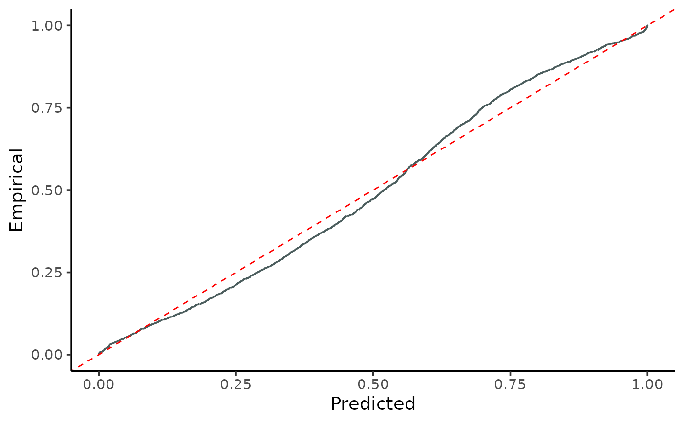
Plots the cumulative distributions of PIT-values for global calibration diagnostics.
Source:R/gg_CD_global.R
gg_CD_global.RdVisualizes the predicted vs. empirical cumulative distributions of PIT-values using ggplot.
This function creates a ggplot graph that compares the cumulative distributions of predicted and empirical Probability Integral Transform (PIT) values. It shows the calibration quality of a regression model by examining how well the predicted values conform to the observed values.
Arguments
- pit
Numeric vector of global PIT-values. It is recommended to calculate these using the
PIT_global()function.- ycal
Numeric vector representing the true observations (y-values) of the response variable from the calibration dataset.
- yhat
Numeric vector of predicted response (y-hat-values) on the calibration dataset.
- mse
Mean Squared Error calculated from the calibration dataset.
Value
A ggplot object displaying a point graph of the empirical versus predicted cumulative distributions of PIT-values.
Examples
n <- 10000
split <- 0.8

# generating heterocedastic data
mu <- function(x1){
10 + 5*x1^2
}

sigma_v <- function(x1){
30*x1
}

x <- runif(n, 1, 10)
y <- rnorm(n, mu(x), sigma_v(x))

x_train <- x[1:(n*split)]
y_train <- y[1:(n*split)]

x_cal <- x[(n*split+1):n]
y_cal <- y[(n*split+1):n]

model <- lm(y_train ~ x_train)

y_hat <- predict(model, newdata=data.frame(x_train=x_cal))

MSE_cal <- mean((y_hat - y_cal)^2)

pit <- PIT_global( y_cal, y_hat,  MSE_cal)

gg_CD_global(pit,y_cal, y_hat, MSE_cal)
